Sunday, October 3, 2010

Correlation Matrix


This is a Correlation Matrix.  The description of this type of graph is quite mathematical and can be confusing for the non-mathematical thinker.  A Correlation Matrix depicts the correlation among M variables (therefore, there is not a set number of variables that must be depicted in this type of graph).  The diagonal elements are always equal to 1.00.  The diagonal elements are the correlations of variables with themselves.  This particular example depicts a calculated protein correlation matrix for phage T7.  

Cartographic Animations


This is a map displaying Cartographic Animation.  As its name implies, Cartographic Animation of a map occurs when computer or video animation is added to a map.  The possibilities are endless for Catographic Animation, but commonly it is used to display some type of change in dimension.  Often the change is depicted in time and at a greater scale (much faster or slower than real time).  This map uses Cartographic Animation to emphasize location...the location of warning signals on these specific interstates or roadways. 

Choropleth Map


This is a Choropleth Map, a thematic map.  A Choropleth Map shades in areas according to the measurement of the statistical data that is being depicted.  In this map, the creator chose to split the positive values with the negative values by the use of different colors--pink shades for negative values and green shades for positive values.  It should be noted that while a Choropleth Map can easily represent degrees of data visually, the representation on such a map can be "misleading" due to the size of a state.  For example, a larger area (such as Texas) will likely have more of a visual impact on the viewer because of its size, but its size is unrelated to the data being displayed.  

Climograph


This is a Climograph.  A Climograph is a graphical representation of the temperature conditions and monthly precipitation for a specific location.  This Climograph includes solstice and equinox cycles as well.  As the description of this graph details, a Climograph is useful for determining a distinct temperature cycle for the area--which would be helpful in planning vegetation and crops.  

Saturday, October 2, 2010

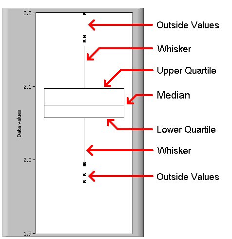
Box Plot


This is a Box Plot graph that shows all the elements of this particular type of graph.  A Box Plot is a graphical depiction of numerical data.  The data is split into 5 groups: (1) the smallest observation (or the sample minimum), (2) the lower quartile, (3) the median, (4) the upper quartile, and (5) the largest observation (or the sample maximum).  As this example demonstrates, a Box Plot can also show outliers (or outside values).  Box plots  can be horizontally or vertically oriented and can be displayed side by side to show variations of data. 

Bilateral Graph


This is a Bilateral Graph.  A Bilateral Graph uses to variables and will show increases on one side combined with decreases on the other.  In this example, it is easy to see that as construction and development loans increased, long term mortgage assets decreased.  As the long term mortgage assets began their assent again, construction and development loans began to fall until they met in the middle of 2009.

Black and White Aerial Photo


This is a Black and White Aerial Photograph.  This was found on Professor Paul Chamberlain's blog.  Chamberlain is the Director of Art and Research Design Center.  To know an artist's true intent for a work, it is always best to get the artist's direct interpretation of the work.  In reference to this photo, Chamberlain explains, "I am fascinated by the built environment (man made stuff) that has evolved over thousands of years, and its relationship with the natural world. Objects that respond to and influence our lifestyles, reflect culture and are embedded in ritual."  As far as cartography is concerned, aerial photos are used to take measurements in preparation of maps and to determine environmental conditions as well as land use.