Saturday, October 23, 2010
Weather Map
Weather maps come in many different forms. This particular weather map is a Surface Analysis Weather Map and is probably the most familiar type of weather map to the general public. A Surface Analysis Weather Map displays current weather conditions at ground level (or on the surface, as the name indicates). This particular shows the high and low pressure systems at the earth's surface. The fronts indicate direction of movement (through the use of the arrows of the front) as well as whether they are cold (blue) or warm (red) fronts.
Waldseemuller Map
The Waldseemuller Map is a wall map of the world and is named after its creator, German cartographer Martin Waldseemuller. Since this map is "inspired by" the Ptolemaic map projection, it bears a strong resemblance to the Ptolemaic map. Waldseemuller's map was published in April of 1507 and its claim to fame is that it is the first known map to use the term "America" in reference to the New World. (This particular image was found on Professor Norman Love's web page for El Paso Community College.)
Windrose
The Wind Rose shows the relative frequency of wind direction. The chart is a 16 point compass with the directions of north, east, south and west falling in a clockwise direction. It appears that each ring on this chart represents a frequency of 10% of the total. The color bars represent the frequency of wind speed. The length of the bars represents percentage of time of the particular the wind speeds (in knots) in the specific directions.
Thursday, October 21, 2010
Upside Down Map
This is the Upside Down Map. There is no official explanation of/for this map other than it is a map of the world drawn from a different perspective. Since we are so used to seeing maps from one perspective, when that perspective is altered, it makes it harder to comprehend. Despite the fact that all the "shapes" of the land masses are the same, it took some time to find the United States because it seemed to be oriented incorrectly (in my mind.)
Wednesday, October 20, 2010
T O Map
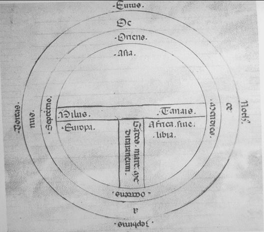
This is a T O Map. This map gets its name from its appearance--it looks like a T inside an O--and evolved during the Middle Ages. The circle was a representation of the known universe while the T divided the world into the three known continents (Europe, Asia, and Africa). The top of the map points east (in contrast to maps today that are usually oriented to the north). The portion above the horizontal line of the T represents Asia, while Europe is on the left and Africa is on the right of the vertical line of the T. The T represents the waterways (Black and Aegean Sea, Nile and Red Sea, and Mediterranean Sea) while the circle represented the oceans surrounding the continent.
Textual Visualization
This is a Textual Visualization. There are many different types of textual visualization, but this would be classified as a "Tag Cloud" where a list of words or phrases are sorted by some measure of relevance. For this particular visualization, stories on the website Digg are placed at the top as they are "dugg." The number in red represents the number of times the story has been dugg as new stories rise to the top. As is apparent, the more "diggs" a story gets, the larger the text appears.
Triangular Plot
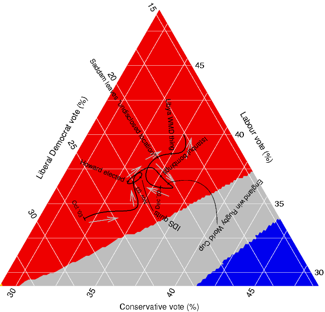
Also known as the Ternary Plot, the Triangular Plot is a graphical representation of three variables as positions in an equilateral triangle. The proportions of the variables always total to some constant (a + b + c = K). Any one variable is not independent of the others, so only two variables must be known. Although most triangular plots are seen in physical sciences such as geology, the creator of this plot used the chart to visually represent the probable outcome of an election based on recent (at the time) opinion polls.
Thematic Map
A Thematic Map is a map that is designed to provide cartographical information thematically, as its name implies. A Thematic Map can use a wide variety of data to focus its theme on--from public debt to tallest buildings to average temperatures in a given month to birth rate and death rate maps. This particular map focuses on the number of New Businesses in the United States. The data is plotted through the use of color with the lightest shades representing the lowest numbers and the darkest shades representing the highest numbers (from 0 to 7,000+).
Topographic Map
A Topographical Map is a map that depicts large-scale detail and relief. This particular Topographic Map is a Global Digital Elevation Model (GDEM) Topographical Map. This map was released by Japan and NASA and is the most complete Topographic Map of the world. Elevations in this map are depicted by color with low elevations appearing in purple, medium elevations appearing in greens and yellows, and high elevations appearing in orange, red, and white.
(Side Note: I had difficulty with this image. I had it inserted in the blog, but when revisiting the blog at a later date, the picture did not appear. The URL for the image is:
http://geology.com/nasa/world-topographic-map/topographic-world-map-lg.jpg ).
Tuesday, October 19, 2010
Star Plot
A Star Plot graphically analyzes data by examining the relative behavior of all variables in a multivariate data set. The Star Plot consists of radii that represent a different variable in the data set. (In this case, letter identification, concepts about principles, writing vocabulary, word reading, and hearing recording are the variables represented.) The Star Plot gets its name from the interconnecting that cuts across each radii at the data length and gives the plot its unique appearance. The length of a particular radii is proportional to the magnitude of the variable.
Stem and Leaf Plot
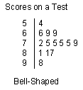
A Stem and Leaf Plot presents data graphically in order visualize the distribution of the data. The data in a Stem and Leaf Plot falls into one of four plot formations--the bell-shaped curve, the U-shaped curve, the J-shaped plot, and the rectangular. The bell-shaped curve is the most common visualization and is often considered an "ideal" formation of data--especially in relation to academic grade distributions. The U-shaped curve is often two bell-shaped curves together and is an indication that the data could be split into two groups. The J-shaped plot is rare and results because data cannot go above or beyond a certain value. The rectangular occurs because the data is dispersed evenly.
Similarity Matrix
A Similarity Matrix is a rectangular array of numbers (matrix) that express the similarity between two data points. The mathematical definition of the representation can be daunting for the non-mathematician. However, the visualization of the data presents a simplified analysis of the data. The lower left quadrant of the map signifies common WAS Word Vectors while the lower right and upper left signify rare WAS Word Vectors.
Statistical Map
A Statistical Map is a map that depicts the variation in the quantity of a factor. This particular map shows the distribution of phone lines in 1992. The numbers represent main lines per 100 inhabitants. The blue shades indicate 0-1 while the rusty orange indicates 45+. The term "main lines" seems to indicate this map is referencing "land lines." It is interesting to note that if current data were to be mapped, the final result would undoubtedly be much different since many Americans have opted out of maintaining a land line in lieu of maintaining a cell phone. Therefore, it is easy to see how this particular data could be "manipulated" by a cartographer.
Scatter Plot
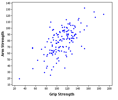
A Scatter Plot displays values for two variables of a particular data set. It shows the relationship between the two variables. For example, this Scatter Plot shows the relationship between Arm Strength and Grip Strength.
Saturday, October 16, 2010
Ptolemaic Map
This is a Ptolemaic Map. This is a map based on Ptolemy's description of the world in his book Geographia (written around 150). This map is significant because it is the first to use latitudinal and longitudinal lines.
Portolan Chart
This is a Portolan Chart. Portolan charts were first created in 14th century in Italy, Portugal, and Spain. They are navigational maps based on descriptions (from European sailors) of the coasts and harbors.
Peters Projection Map
This is a Peters Projection Map. The Peters Projection Map was the "answer" to the challenge of representing a round earth on a flat surface. This map was created by cartographer Dr. Arno Peters in 1974 (the first English version of the map was not printed until 1983). This map remains true to area and is considered an equal-area cylindric map.
Parallel Coordinate Graph
This is a Parallel Coordinate Graph. A parallel coordinate graph is used for multivariate data sets. Admittedly, I am not sure what anyone could get out of such a graph. I searched in order to find some sort of "best practices" usage for this type of graph but could not find one. My best guess is that this graph would be useful in determining similarities of patterns among variables within a multivariate set. Perhaps, much like looking at the graph seems to be, it is more literally a "needle in the haystack" syndrome in finding the variables that "clump" together and thus grab the viewer's attention the most.
Proportional Circle Map
This is a Proportional Circle Map. In a proportional circle map, the data is shown in relation to the size of the circle. In this map, the circles represent a population of 10,000 to 250,000 with the smallest circles representing the smallest population (10,000) and the largest circles representing the largest population (250,000).
Propaganda Map
This is a Propaganda Map. This might be one of my favorite maps for this project (although, it is hard to choose a favorite because I tried to choose images that personally appealed to me, so there are a number of favorites here.) Propaganda maps were most prominent in the World Wars. Propaganda is a "persuasive" technique in which the creator uses distortion to convince the viewer to agree with him. The detail of this map is quite intriguing--the use of "people" to represent the different countries.
Subscribe to:
Posts (Atom)