Saturday, October 23, 2010

Weather Map


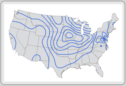
Weather maps come in many different forms.  This particular weather map is a Surface Analysis Weather Map and is probably the most familiar type of weather map to the general public.  A Surface Analysis Weather Map displays current weather conditions at ground level (or on the surface, as the name indicates).  This particular shows the high and low pressure systems at the earth's surface.  The fronts indicate direction of movement (through the use of the arrows of the front) as well as whether they are cold (blue) or warm (red) fronts.

Waldseemuller Map


The Waldseemuller Map is a wall map of the world and is named after its creator, German cartographer Martin Waldseemuller.  Since this map is "inspired by" the Ptolemaic map projection, it bears a strong resemblance to the Ptolemaic map.  Waldseemuller's map was published in April of 1507 and its claim to fame is that it is the first known map to use the term "America" in reference to the New World.  (This particular image was found on Professor Norman Love's web page for El Paso Community College.)

Windrose


The Wind Rose shows the relative frequency of wind direction.  The chart is a 16 point compass with the directions of north, east, south and west falling in a clockwise direction.  It appears that each ring on this chart represents a frequency of 10% of the total.  The color bars represent the frequency of wind speed.  The length of the bars represents percentage of time of the particular the wind speeds (in knots) in the specific directions.  

Thursday, October 21, 2010

Upside Down Map


This is the Upside Down Map.  There is no official explanation of/for this map other than it is a map of the world drawn from a different perspective.  Since we are so used to seeing maps from one perspective, when that perspective is altered, it makes it harder to comprehend.  Despite the fact that all the "shapes" of the land masses are the same, it took some time to find the United States because it seemed to be oriented incorrectly (in my mind.)

Wednesday, October 20, 2010

T O Map


This is a T O Map.  This map gets its name from its appearance--it looks like a T inside an O--and evolved during the Middle Ages.  The circle was a representation of the known universe while the T divided the world into the three known continents (Europe, Asia, and Africa).  The top of the map points east (in contrast to maps today that are usually oriented to the north).  The portion above the horizontal line of the T represents Asia, while Europe is on the left and Africa is on the right of the vertical line of the T.  The T represents the waterways (Black and Aegean Sea, Nile and Red Sea, and Mediterranean Sea) while the circle represented the oceans surrounding the continent. 

Textual Visualization


This is a Textual Visualization.  There are many different types of textual visualization, but this would be classified as a "Tag Cloud" where a list of words or phrases are sorted by some measure of relevance.  For this particular visualization, stories on the website Digg are placed at the top as they are "dugg."  The number in red represents the number of times the story has been dugg as new stories rise to the top.  As is apparent, the more "diggs" a story gets, the larger the text appears.

Triangular Plot


Also known as the Ternary Plot, the Triangular Plot is a graphical representation of three variables as positions in an equilateral triangle.  The proportions of the variables always total to some constant      (a + b + c = K).  Any one variable is not independent of the others, so only two variables must be known.  Although most triangular plots are seen in physical sciences such as geology, the creator of this plot used the chart to visually represent the probable outcome of an election based on recent (at the time) opinion polls. 

Thematic Map


A Thematic Map is a map that is designed to provide cartographical information thematically, as its name implies.  A Thematic Map can use a wide variety of data to focus its theme on--from public debt to tallest buildings to average temperatures in a given month to birth rate and death rate maps.  This particular map focuses on the number of New Businesses in the United States.  The data is plotted through the use of color with the lightest shades representing the lowest numbers and the darkest shades representing the highest numbers (from 0 to 7,000+). 

Topographic Map


A Topographical Map is a map that depicts large-scale detail and relief.  This particular Topographic Map is a Global Digital Elevation Model (GDEM) Topographical Map.  This map was released by Japan and NASA and is the most complete Topographic Map of the world.  Elevations in this map are depicted by color with low elevations appearing in purple, medium elevations appearing in greens and yellows, and high elevations appearing in orange, red, and white.
(Side Note: I had difficulty with this image.  I had it inserted in the blog, but when revisiting the blog at a later date, the picture did not appear.  The URL for the image is:

http://geology.com/nasa/world-topographic-map/topographic-world-map-lg.jpg ).


Tuesday, October 19, 2010

Star Plot


A Star Plot graphically analyzes data by examining the relative behavior of all variables in a multivariate data set.  The Star Plot consists of radii that represent a different variable in the data set.  (In this case,  letter identification, concepts about principles, writing vocabulary, word reading, and hearing recording are the variables represented.)  The Star Plot gets its name from the interconnecting that cuts across each radii at the data length and gives the plot its unique appearance.   The length of a particular radii is proportional to the magnitude of the variable.

Stem and Leaf Plot


A Stem and Leaf Plot presents data graphically in order visualize the distribution of the data.  The data in a Stem and Leaf Plot falls into one of four plot formations--the bell-shaped curve, the U-shaped curve, the J-shaped plot, and the rectangular.  The bell-shaped curve is the most common visualization and is often considered an "ideal" formation of data--especially in relation to academic grade distributions.  The U-shaped curve is often two bell-shaped curves together and is an indication that the data could be split into two groups.  The J-shaped plot is rare and results because data cannot go above or beyond a certain value.   The rectangular occurs because the data is dispersed evenly.    

Similarity Matrix


A Similarity Matrix is a rectangular array of numbers (matrix) that express the similarity between two data points.  The mathematical definition of the representation can be daunting for the non-mathematician.  However, the visualization of the data presents a simplified analysis of the data.  The lower left quadrant of the map signifies common WAS Word Vectors while the lower right and upper left signify rare WAS Word Vectors.  

Statistical Map


A Statistical Map is a map that depicts the variation in the quantity of a factor.  This particular map shows the distribution of phone lines in 1992.  The numbers represent main lines per 100 inhabitants.  The blue shades indicate 0-1 while the rusty orange indicates 45+.  The term "main lines" seems to indicate this map is referencing "land lines."  It is interesting to note that if current data were to be mapped, the final result would undoubtedly be much different since many Americans have opted out of maintaining a land line in lieu of maintaining a cell phone.  Therefore, it is easy to see how this particular data could be "manipulated" by a cartographer.


Scatter Plot


A Scatter Plot displays values for two variables of a particular data set.  It shows the relationship between the two variables.  For example, this Scatter Plot shows the relationship between Arm Strength and Grip Strength.  

Saturday, October 16, 2010

Ptolemaic Map


This is a Ptolemaic Map.  This is a map based on Ptolemy's description of the world in his book Geographia (written around 150).  This map is significant because it is the first to use latitudinal and longitudinal lines.  

Portolan Chart


This is a Portolan Chart.  Portolan charts were first created in 14th century in Italy, Portugal, and Spain.  They are navigational maps based on descriptions (from European sailors) of the coasts and harbors.  

Peters Projection Map


This is a Peters Projection Map.  The Peters Projection Map was the "answer" to the challenge of representing a round earth on a flat surface.  This map was created by cartographer Dr. Arno Peters in 1974 (the first English version of the map was not printed until 1983).  This map remains true to area and is considered an equal-area cylindric map.

Parallel Coordinate Graph


This is a Parallel Coordinate Graph.   A parallel coordinate graph is used for multivariate data sets.  Admittedly, I am not sure what anyone could get out of such a graph.  I searched in order to find some sort of "best practices" usage for this type of graph but could not find one.  My best guess is that this graph would be useful in determining similarities of patterns among variables within a multivariate set.  Perhaps, much like looking at the graph seems to be, it is more literally a "needle in the haystack" syndrome in finding the variables that "clump" together and thus grab the viewer's attention the most.  

Proportional Circle Map


This is a Proportional Circle Map.  In a proportional circle map, the data is shown in relation to the size of the circle.  In this map, the circles represent a population of 10,000 to 250,000 with the smallest circles representing the smallest population (10,000) and the largest circles representing the largest population (250,000).  

Propaganda Map


This is a Propaganda Map.  This might be one of my favorite maps for this project (although, it is hard to choose a favorite because I tried to choose images that personally appealed to me, so there are a number of favorites here.)  Propaganda maps were most prominent in the World Wars.  Propaganda is a "persuasive" technique in which the creator uses distortion to convince the viewer to agree with him.  The detail of this map is quite intriguing--the use of "people" to represent the different countries. 

PLSS (Base Map)


This is another example of the PLSS Map.  Since the other PLSS image is integrated with current technology (Google Earth), I felt it only appropriate to post an image closer to the "original" intent of the system's operations.  This is a portion of Minnesota's statewide PLSS map.  This image portrays a better view of the classification and division of the system.

PLSS Map


This is a PLSS Map.  PLSS stands for Public Land Survey System and it is a classification and division of land in the United States.   This system was developed in 1785.  The above image is the joining of old and new.  This is an image of the PLSS system in Google Earth (known as a PLSGE). 

Population Profile


This is a Population Profile.  A population profile is a graphical representation (a chart) of population of an area as a function of their ages.  This example is a chart of the immigrants to the United States in 2004.  It splits the population up in age (by percentages) as well as by gender.    

Planimetric Map - 2

This is a Planimetric Map.  This map is of Vancouver, Washington and depicts the Vancouver barracks and surrounding area.  It doesnt directly state, but I believe this was created in the mid to late 40's.  A Planimetric Map is a "flat map" in that it only depicts the horizontal features of an area and does not show elevation.  This type of map is also known as a line map.

Planimetric Map - 1


A Planimetric Map is a "flat" map that represents its features two-dimensionally (horizontally) only.  Vertical features such as height or elevation are not displayed on planimetric maps. I thought this example of a planimetric map was unique and interesting.  It took me some digging and almost near completion of my own map blog to realize that the original source of this image is from a former student's blog and her own personal experience with this map.  I originally found this image on a blog entitled Cartophilia: Maps and Map Memorabilia.  This is an interesting blog, but it appears that it is no longer maintained.  This blogger was impressed by Mary Ann Vance's above image that she posted on her Map Catalog blog.  (Based off of limited information, I can only deduce that she was an FSU student for this course in May 2008 and used this for her planimetric map image.)  I really like this map and wanted to include it in my blog as well.  In the interest of not "copying" another student, I will search for an addition planimetric map image to post in a separate post.  

Wednesday, October 13, 2010

Mercator Projection Map


This is a Mercator Projection Map.  This map was created in 1569 by Flemish cartographer Gerardus Mercator.  It was created for nautical uses and became the standard map for nautical purposes due to the straight lines and its conformal nature.  The scale increases from the equator to the poles which distorts the size and shapes of the larger continents.  

Mental Map

http://kelsocartography.com/blog/?p=2166

This is a Mental Map.  A Mental Map is a taken from an individual's perception or perspective of his own world.  This Mental Map appeared on the cover of The Economist and was the creator's (illustrator Jon Berkeley) depiction of how China sees the world.  In an odd sort of way, this Mental Map is a pun on mental maps because the creator is depicting how "China sees the world" through his own viewpoints and perceptions (and to support the "story" in the magazine.)  An actual Mental Map of how "China sees the world" would likely be different (if it were possible to get one person to represent an entire country's perception in such a manner.)

Tuesday, October 12, 2010

LIDAR - Light Detection and Ranging


This is a LIDAR (Light Detection and Ranging.)    LIDAR is remote sensing technology.  LIDAR uses laser pulses to determine distance to an object or surface.  The time delay between the transmission of a pulse and its reflected signal is measured to determine the range to an object.  This is one of a series of LIDAR images that were taken of "Ground Zero" on September 27, 2001.

Lorenz Curve


This is a Lorenz Curve (also known as an Accumulative Line Graph.)  The Lorenz Curve is a graphical representation of the proportionality of a distribution.  It is commonly used to analyze inequality (and is usually associated with income distributions.  This is a Lorenz Curve of Household Income and Expenditures for 2002-2003.  

Saturday, October 9, 2010

Internet Map - "The Chris Harrison Project"

Chris Harrison is a blogger who used information collected from "The Dimes Project" to create visualizations that show how cities across the globe are interconnected via router configuration.  These are a type of Internet Map, and they are interesting to view not only for the visualization technique that Harrison chose (white on black) but for the comparisons of interconnectivity across the globe.

World Connection Density


World City-to-City Connections


 European City-to-City Connections


North American City-to-City Connections


Internet Map


This is an Internet Map.  Internet Maps are a visualization of how the internet connects people and places across the globe.  (I found a blog by Chris Harrison that has multiple visualizations of the internet.  I like the visual appeal of his "project," but I wasn't sure if others had used some of his images.  I am including these images on a separate Internet Map post.)

Isopleth


This is an Isopleth.  Isopleth maps generalize and simplify data with a continuous distribution.   Isopleths always form enclosed circles and never cross each other or divide.  The isopleth interval is the difference in value between two adjacent isopleths.  

Isopach


This is an Isopach.  Isopachs are contour lines which communicate the thickness of rock or sediment.

Isohyets


This is an Isohyet.  An isohyet is a line drawn on a map that connects points of areas that have the same amount of rainfall in a given time period.  

Isotachs


This is an Isotach.  An isotach is a line that connects points with equal wind speed.  

Isobar


This is an Isobar.  Isobars join equal data.  In meteorology, an isobar is a line connecting points of equal atmospheric pressure; in weather, an isobar is a line which joins points of equal pressure.  The example above shows mean-sea-level pressure.  

Isoline Map


This is an Isoline Map.  Isolines are used to describe distributions on a map.  Isolines are commonly used in weather maps but can be used for any type of data.  Lines connect in places that have the same data.  The data used in isoline maps is interval or ratio (sometimes ordinal) and the feature type is raster or vector.  

Index Value Plot


This is an Index Value Plot.  In this type of map, rather than plotting absolute values, index values are plotted.  This plot is a Greed vs. Fear plot for Australia comparing 1949-1982 with the present.  This is a visualization type of map.  

Infrared Aerial Photo


This is an Infrared Aerial Photo.    Infrared photography occurs when infrared light is allowed to pass through to the camera but all or most of the other visible spectrum is blocked.  This is an aerial photo (as displayed on a previous post) that also uses infrared photography.  This photo displays red tones where winter wheat was growing.  

Friday, October 8, 2010

Hypsometric Map


This is a Hypsometric Map.  This is a topographic map that portrays elevations with contours and/or color shading or tinting.  This is Hypsometric Map is from a DEM and due to software capabilities, the number of classes and colors are arbitrary...there can be a small number of classes and colors or a large number of classes and colors.

Histogram


This is a Histogram.  Histograms  are used to provide a visualization of the data.  Similar to the Stem and Leaf Plot diagram, if the sample is large enough, the results will often fall into a bell curve.  In this example, the weighted scores are along the x-axis while the frequency (number of students) is along the y-axis.  This sample was large enough (30 or more students) to result in the bell curve.

Thursday, October 7, 2010

Genome Map


This is a Genome Map.  A genome is an organism's genetic material; therefore, a Genome Map assists scientists in navigating an organism's genome.  They are usually used to help scientists find new genes.  Some "landmarks" of a genome map are regulatory sites that turn genes on and off, genes themselves, and DNA sequences.  


GIS Database Project

DRG - Digital Raster Graphic
DLG - Digital Line Graph
DEM - Digital Elevation Model
DOQ - Digital Orthophoto Quadrangle

This post is somewhat of a "repetition" of other maps within this blog.  I thought that it would be a valuable learning tool to put the four maps together that are a part of the GIS Database Project for the San Francisquito Creek.  These maps are the DRG, the DLG, the DEM, and the DOQ.  This project shows how maps are used in conjunction with each other for a common goal.  As the site explains, "while the GIS project is by no means comprehensive, it does provide an introduction to using geospatial data to frame and explicate natural resource questions."

Wednesday, October 6, 2010

Flow Map


This is a Flow Map.  Flow Maps are a unique amalgamation of flow charts and maps.  Flow Maps show the movement of data from one location to another.  According to the site that this map was found on, flow maps are often drawn by hand because there are few algorithms available to generate this type of map on a computer.  (However, it should be noted that this site is dated in 2005, so this information could be outdated.)  I liked the unique eyecatching look of this map.  This map originally appeared in the UK Interdependence Report.